Context
In February 2025, I joined the Peetchr team as Head of Product. The objective was to apply the final polish to the product by getting customers’feebacks before its commercial launch in March-April
Peetchr was positioned as an innovative AI-powered screening tool for Talent acquisition managers using a social messaging chatbot to engage candidates. However, an intensive round of user testing with 20 key stakeholders (candidates and recruiters) revealed a stark reality: the product was confusing, its value proposition was muddled, and it was not market-ready.
TL:DR
Initial Product Failure
Our original product, an AI chatbot for candidates applications, was rejected during user testing just five months before a critical deadline. Users found it confusing, the AI was judged untrustworthy, and they would not pay for it.
The Strategic Pivot
We executed a full pivot after a key discovery: our true asset was not the chatbot, but the core AI algorithm, which had already been validated in the real world by generating revenue for the traditional recruitment agency managed by the 2 founders.
Redesign for Trust & Control
The product was rebuilt from scratch to solve the core problem of AI skepticism.
We focused on building user confidence with features that provided Trust (letting recruiters test the AI on themselves) and Control (a transparent, fully configurable scorecard).
Immediate Commercial Success
The new product launched on June 30th, 2025 and was an instant success. Within eight days, we secured a negotiation for a worldwide contract with a multi-subsidiary company and onboarded five other companies for free trials.

Initial Product Failure
Our original product, an AI chatbot for candidates applications, was rejected during user testing just five months before a critical deadline. Users found it confusing, the AI was judged untrustworthy, and they would not pay for it.

The Strategic Pivot
We executed a full pivot after a key discovery: our true asset was not the chatbot, but the core AI algorithm, which had already been validated in the real world by generating revenue for the traditional recruitment agency managed by the 2 founders.
Redesign for Trust & Control
The product was rebuilt from scratch to solve the core problem of AI skepticism.
We focused on building user confidence with features that provided Trust (letting recruiters test the AI on themselves) and Control (a transparent, fully configurable scorecard).
Immediate Commercial Success
The new product launched on June 30th, 2025 and was an instant success. Within eight days, we secured a negotiation for a worldwide contract with a multi-subsidiary company and onboarded five other companies for free trials.

The Initial Vision
A Chatbot Led Revolution
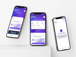
In early 2025, Peetchr was conceived as a disruptive force in talent acquisition. It was an Application Screening System built on the premise that an AI-powered chatbot on platforms like WhatsApp could revolutionize the monotonous and often impersonal application process.
Superior Candidate Qualification
Enhanced Candidate Engagement
The core problem with most Applicant Tracking Systems (ATS) is their reliance on rudimentary keyword-matching algorithms, which are notoriously inaccurate. Peetchr’s AI was engineered to perform a multi-dimensional analysis of candidates, evaluating personality, soft skills, hard skills, team fit, and culture fit to create a predictive profile of success.
With industry data showing application abandonment rates as high as 82%, it was clear the candidate experience was broken. By leveraging familiar, conversational messaging apps, Peetchr aimed to create a modern, low-friction, and engaging process that would significantly increase completion rates and improve employer branding.
Superior Candidate Qualification
The core problem with most Applicant Tracking Systems (ATS) is their reliance on rudimentary keyword-matching algorithms, which are notoriously inaccurate. Peetchr’s AI was engineered to perform a multi-dimensional analysis of candidates, evaluating personality, soft skills, hard skills, team fit, and culture fit to create a predictive profile of success.
Enhanced Candidate Engagement
With industry data showing application abandonment rates as high as 82%, it was clear the candidate experience was broken. By leveraging familiar, conversational messaging apps, Peetchr aimed to create a modern, low-friction, and engaging process that would significantly increase completion rates and improve employer branding.
The initial candidate journey
The initial user journey was complex. It required a recruiter to manually place a Peetchr link in their company’s ATS. A candidate would click this link from a job board, land on a Peetchr-hosted page, create an account, and then be redirected to WhatsApp to begin a lengthy, question-based conversation with the AI. This multi-step, multi-platform process was the first sign of underlying friction.
Phase 1
A Confrontation with Reality:
The User Tests
To validate our assumptions before launch, I initiated a series of 20 in-depth user tests with a representative panel of candidates and recruiters. The feedback was not just negative; it was fundamentally challenging to our entire product strategy.
Candidate Feedbacks
Recruiter Feedback
Candidates were intrigued by the concept but frustrated by the execution. The process felt disjointed and created more anxiety than it relieved.
- Lack of Clarity: « Am I talking to a bot or a person? » « Does the recruiter see this chat transcript? » « Is this chat the entire application, or is it just a pre-screening? » These questions were rampant. The ambiguity of the process led candidates to be overly cautious and formal, defeating the purpose of a quick, conversational interface.
- High Cognitive Load: Instead of a simple chat, the interaction felt like a high-stakes, written examination on a mobile device, a fundamentally unsuitable format for thoughtful, long-form answers.
Recruiters loved the sales pitch but were deeply disappointed by the product itself.
- Opaque AI: The AI score was the centerpiece of the value proposition, but it was a complete black box. « How is this score calculated? What criteria is it using? Can I trust it? » Recruiters felt they were being asked to cede control of a critical decision-making process to an algorithm they didn’t understand.
- Workflow Disruption: The lack of direct ATS integration was a deal-breaker. The need to manually copy and paste links between systems was seen as adding work, not reducing it.
- Missing Core Functionality: The platform lacked basic features essential to a recruiter’s daily workflow, such as internal commenting, collaborative tools, and intuitive candidate funnel management.
Candidate Feedbacks
Candidates were intrigued by the concept but frustrated by the execution. The process felt disjointed and created more anxiety than it relieved.
- Lack of Clarity: « Am I talking to a bot or a person? » « Does the recruiter see this chat transcript? » « Is this chat the entire application, or is it just a pre-screening? » These questions were rampant. The ambiguity of the process led candidates to be overly cautious and formal, defeating the purpose of a quick, conversational interface.
- High Cognitive Load: Instead of a simple chat, the interaction felt like a high-stakes, written examination on a mobile device, a fundamentally unsuitable format for thoughtful, long-form answers.
Recruiter Feedback
Recruiters loved the sales pitch but were deeply disappointed by the product itself.
- Opaque AI: The AI score was the centerpiece of the value proposition, but it was a complete black box. « How is this score calculated? What criteria is it using? Can I trust it? » Recruiters felt they were being asked to cede control of a critical decision-making process to an algorithm they didn’t understand.
- Workflow Disruption: The lack of direct ATS integration was a deal-breaker. The need to manually copy and paste links between systems was seen as adding work, not reducing it.
- Missing Core Functionality: The platform lacked basic features essential to a recruiter’s daily workflow, such as internal commenting, collaborative tools, and intuitive candidate funnel management.
« This is a promising concept, but the product is a beta at best. We would not pay for this. »
The final verdict was delivered unequivocally by a senior recruiter
« This is a promising concept, but the product is a beta at best. We would not pay for this. »
The final verdict was delivered unequivocally by a senior recruiter
Phase 2
The Pivot: Forging a New Vision from the Ashes
The user feedback created a crisis, but also an opportunity. Launching was not an option. With a non-negotiable financial deadline of June 2025, we had to reinvent the product.
We established a new North Star: launch a simpler, clearer product that delivers undeniable value.
The 4 rules of our pivot
Explain the AI
Make its workings transparent and intuitive.
Cut Features
Aggressively remove anything that did not directly support the core value.
Minimize Backend Changes
Leverage existing technology wherever possible to meet the deadline.
Reinforce the Core Value
Every design and feature decision must answer the question: « Does this make qualification faster and more accurate? »
Unearthing Our True Differentiator
A pivotal workshop with the founders and CTO led to a technical breakthrough: direct ATS integration was possible. We could pull applications automatically, analyze them, and then decide on next steps. This single discovery rendered the entire candidate-facing chatbot flow obsolete, freeing up immense technical resources to perfect the recruiter’s SaaS platform.
By shedding the chatbot, we were forced to confront a critical question: what was our real competitive advantage? The answer was hiding in plain sight: the AI algorithm itself.
The founder, who also runs a successful talent search agency, then made a stunning revelation:
« I’ve been using this exact algorithm for my own clients for over a year. It’s generated €500k in revenue. »
This was the ultimate validation. We possessed a proven, revenue-generating technology. Our failure was not in the tech, but in the product wrapping around it. We had the perfect engine; we just needed to build the right car.
Then I focused on defining our unique position in the market. I conducted a comprehensive competitive analysis, which included a SWOT, a head-to-head feature comparison, and mapping competitor offerings across the entire customer journey.
The insights from this analysis were instrumental, empowering me to propose a distinct market positioning and collaborate with the founders to craft a tagline that perfectly captured our new identity.

The reborned value proposition
From « Peetchr, the recruitment solution on social media apps »
to « PeetchrAI is the talent intelligence solution that qualifies your candidates, so you only need to contact the top 5. »
Unearthing Our True Differentiator
A pivotal workshop with the founders and CTO led to a technical breakthrough: direct ATS integration was possible. We could pull applications automatically, analyze them, and then decide on next steps. This single discovery rendered the entire candidate-facing chatbot flow obsolete, freeing up immense technical resources to perfect the recruiter’s SaaS platform.
By shedding the chatbot, we were forced to confront a critical question: what was our real competitive advantage? The answer was hiding in plain sight: the AI algorithm itself.
The founder, who also runs a successful talent search agency, then made a stunning revelation:
« I’ve been using this exact algorithm for my own clients for over a year. It’s generated €500k in revenue. »
This was the ultimate validation. We possessed a proven, revenue-generating technology. Our failure was not in the tech, but in the product wrapping around it. We had the perfect engine; we just needed to build the right car.
Then I focused on defining our unique position in the market. I conducted a comprehensive competitive analysis, which included a SWOT, a head-to-head feature comparison, and mapping competitor offerings across the entire customer journey.
The insights from this analysis were instrumental, empowering me to propose a distinct market positioning and collaborate with the founders to craft a tagline that perfectly captured our new identity.
The reborned value proposition
From « Peetchr uses social messaging to engage your candidates »
to « PeetchrAI is the talent intelligence solution that qualifies your candidates, so you only need to contact the top 5. »
PeetchrAI, don’t miss the right Talent again.
Beyond the resume, the augmented candidate profile.
Peetchr, the talent intelligence solution
Phase 3
Designing & Prototyping
With a clear and validated product vision, we moved into a rapid five-week design and prototyping phase. The objective was to translate our new strategy into a tangible, intuitive, and trustworthy user experience. This phase was structured around an agile workflow to ensure consistent progress and alignment between product, design, and development.
A Disciplined Five-Week Design Sprint
To ensure focus and rapid delivery, we distilled the new product into the five core epics of the old product we decided to keep:
Homepage

Job offer configuration

Job offer details

Job offer list

Candidate profile
We implemented an optimized weekly design process that allowed the front-end development team to begin to work on a new, fully realized epic every Monday:
- Monday & Tuesday: The product designer lead developed initial wireframes and v0 proposals.
- Wednesday: A workshop was held with the founders to review, validate, and iterate on the proposals.
- Thursday Morning: The proposed designs were validated with the CTO to ensure technical feasibility using existing backend architecture.
- Thursday & Friday: The final, high-fidelity UI was delivered by our UI Designer, ready for development the following week.
A Disciplined Five-Week Design Sprint
To ensure focus and rapid delivery, we distilled the new product into the five core epics of the old product we decided to keep:
Homepage
Job offer list
Job offer details
Job offer configuration
Candidate profile
We implemented an optimized weekly design process that allowed the front-end development team to begin to work on a new, fully realized epic every Monday:
- Monday & Tuesday: The product designer lead developed initial wireframes and v0 proposals.
- Wednesday: A workshop was held with the founders to review, validate, and iterate on the proposals.
- Thursday Morning: The proposed designs were validated with the CTO to ensure technical feasibility using existing backend architecture.
- Thursday & Friday: The final, high-fidelity UI was delivered by our UI Designer, ready for development the following week.
Designing an Actionable Homepage
The homepage was the first and most critical screen to design, as it needed to instantly communicate our value proposition of speed and efficiency.
We designed not one, but two distinct homepage states to cater to the user’s journey:
- Global Activity View: This default view provides a comprehensive overview of all active job openings and key activities, allowing recruiters to catch up at a glance.
- Detailed Job View: This state transforms the homepage into an actionable to-do list for a specific job recruitment, enabling recruiters to immediately engage with new candidates and manage their pipeline, thus saving valuable time.
Homepage Global Activity View // Wireframe

Homepage Global Activity View // Final UI

Homepage Detailed Job View // Wireframe

Homepage Detailed Job View // Final UI

Designing an Actionable Homepage
The homepage was the first and most critical screen to design, as it needed to instantly communicate our value proposition of speed and efficiency.
We designed not one, but two distinct homepage states to cater to the user’s journey:
- Global Activity View: This default view provides a comprehensive overview of all active job openings and key activities, allowing recruiters to catch up at a glance.
- Detailed Job View: This state transforms the homepage into an actionable to-do list for a specific job recruitment, enabling recruiters to immediately engage with new candidates and manage their pipeline, thus saving valuable time.
Homepage Global Activity View // Wireframe
Homepage Global Activity View // Final UI
Homepage Detailed Job View // Wireframe
Homepage Detailed Job View // Final UI
Solving for AI Explainability: A Strategy of Trust and Control
Solving for AI Explainability: A Strategy of Trust and Control
Pillar 1: Building Trust Through Experience
We decided against forcing users to read long, technical explanations. Instead, we leveraged our confidence in the algorithm’s accuracy to create an experiential « Wow effect. »
The core idea was to have users experience the personality test themselves. The underlying principle is simple: « If the AI’s analysis is accurate for me, I can trust it to be accurate for candidates. »
We implemented this technique at two critical moments in the customer journey:
- Commercial Phase: A dedicated landing page was created for lead generation, allowing potential customers to analyze their own profiles as part of the sales process.
- Onboarding Phase: The initial empty-state homepage actively encourages new users to start their journey by performing their own analysis, creating an immediate, personal, and impressive demonstration of the product’s power.

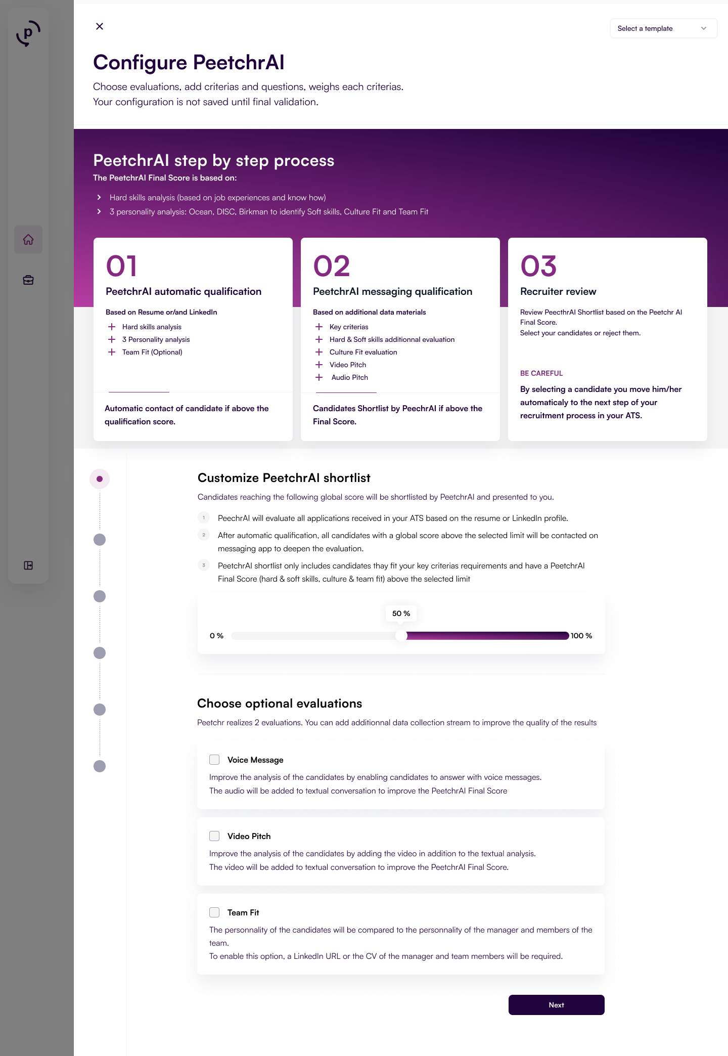
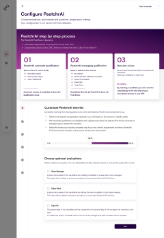


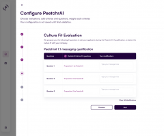


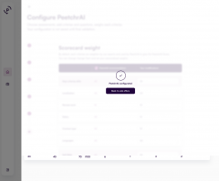
Pillar 2: Giving Control Through Transparency
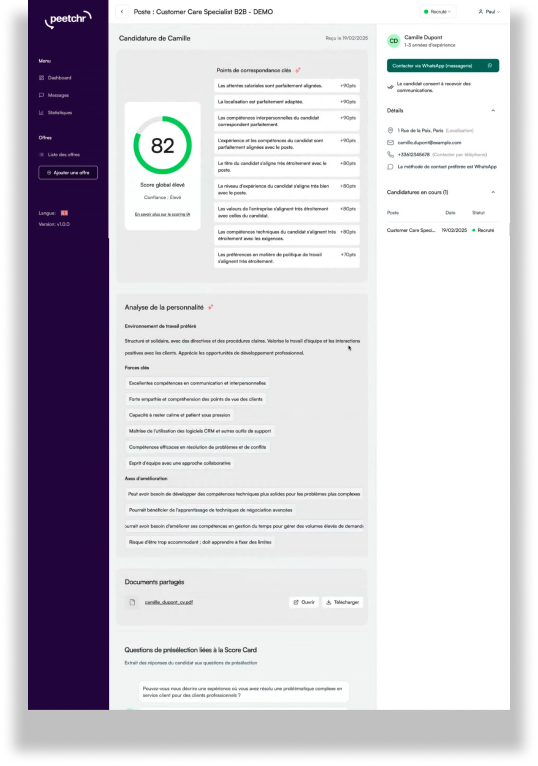
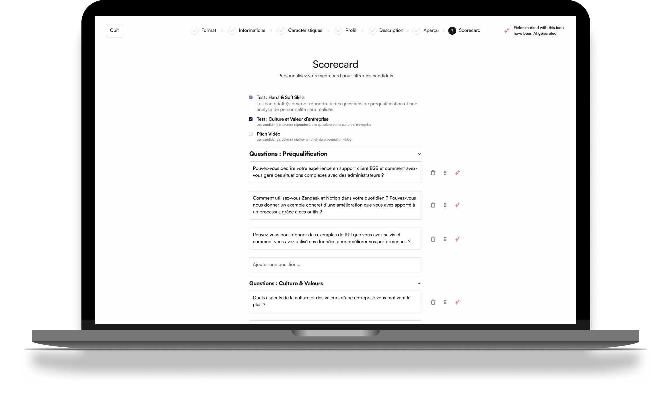
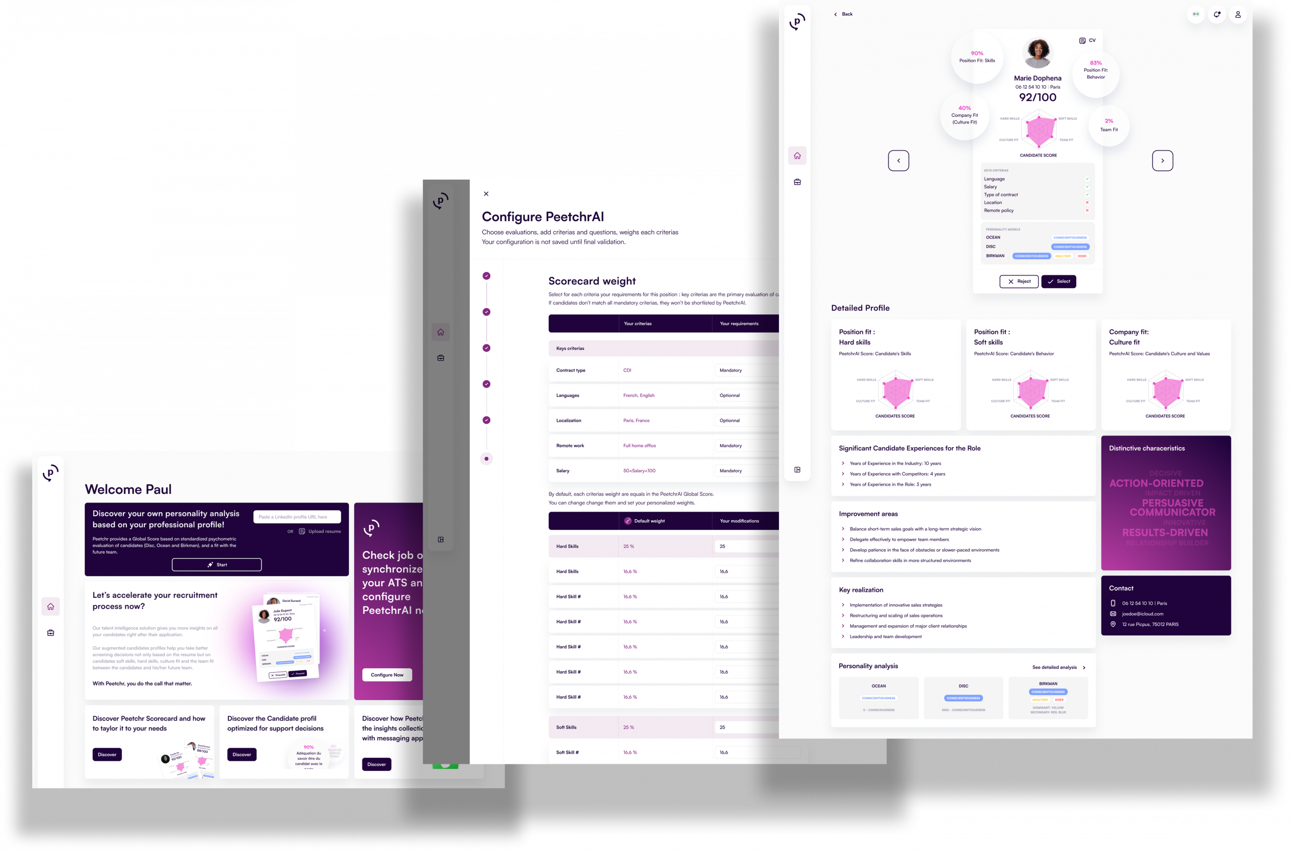
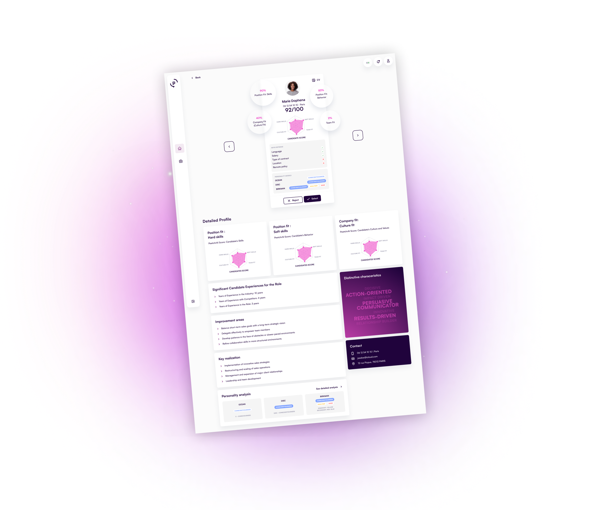
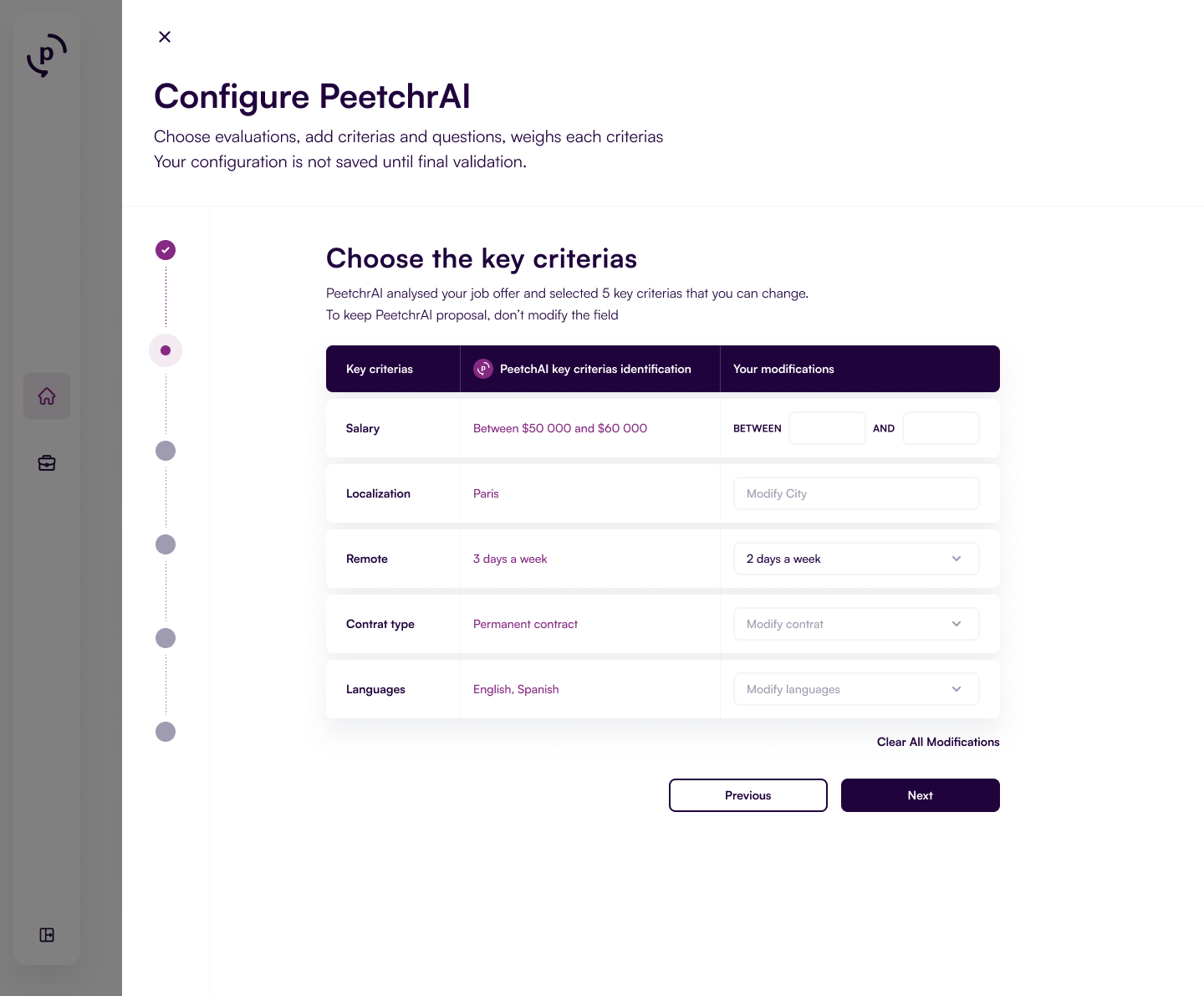
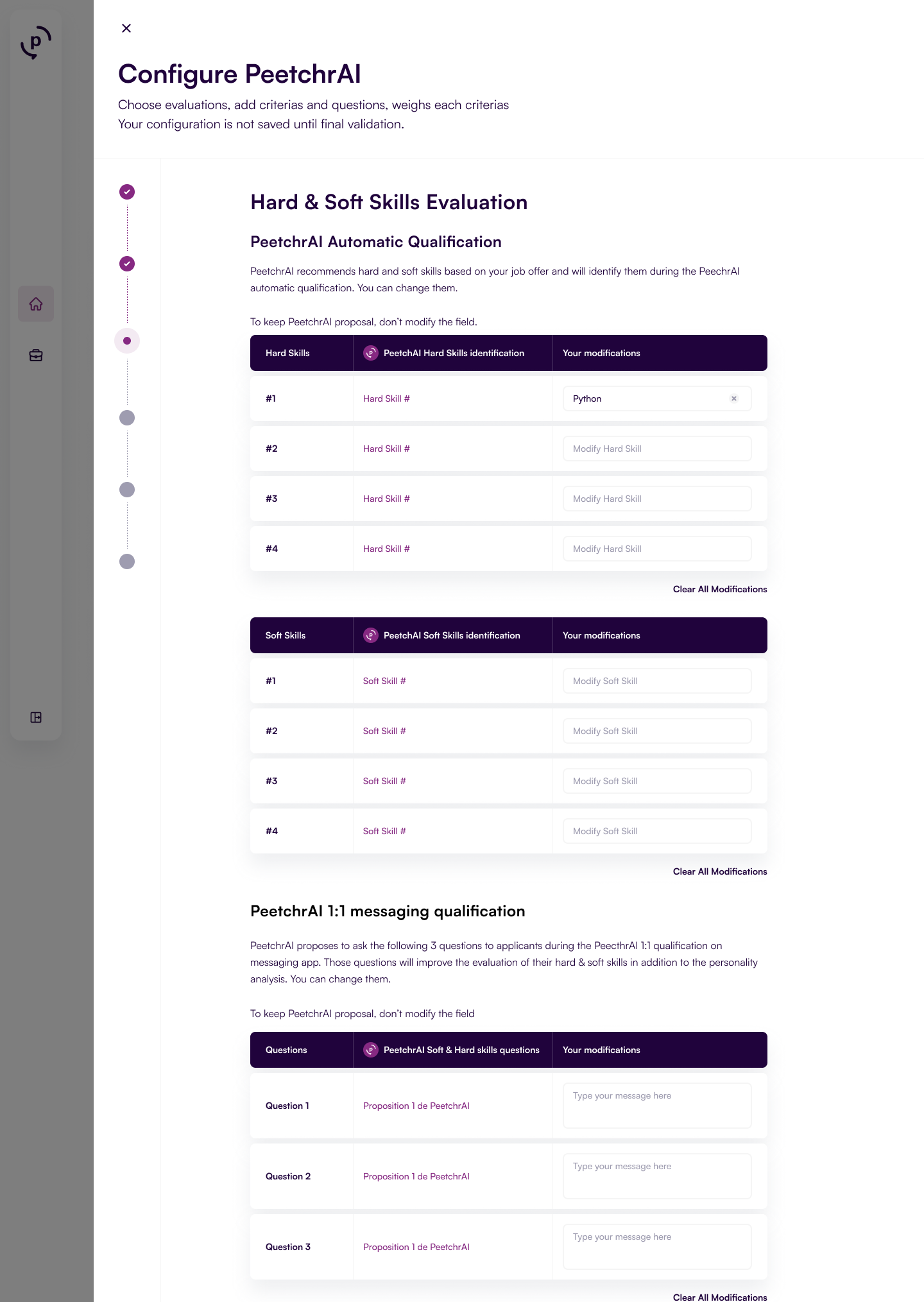
Trust is unsustainable without control. Recruiters rely on scorecards to rationally compare candidates, and they need visibility into any tool that assists this process. The first version of our product, which used an abstract system of tests and questions, failed to provide this clarity.
For the new version, we implemented a robust configuration process that allows users to:
- Review the details of each analysis for every job they create and fine tune the analysis (skills to analyse or question to ask candidates).
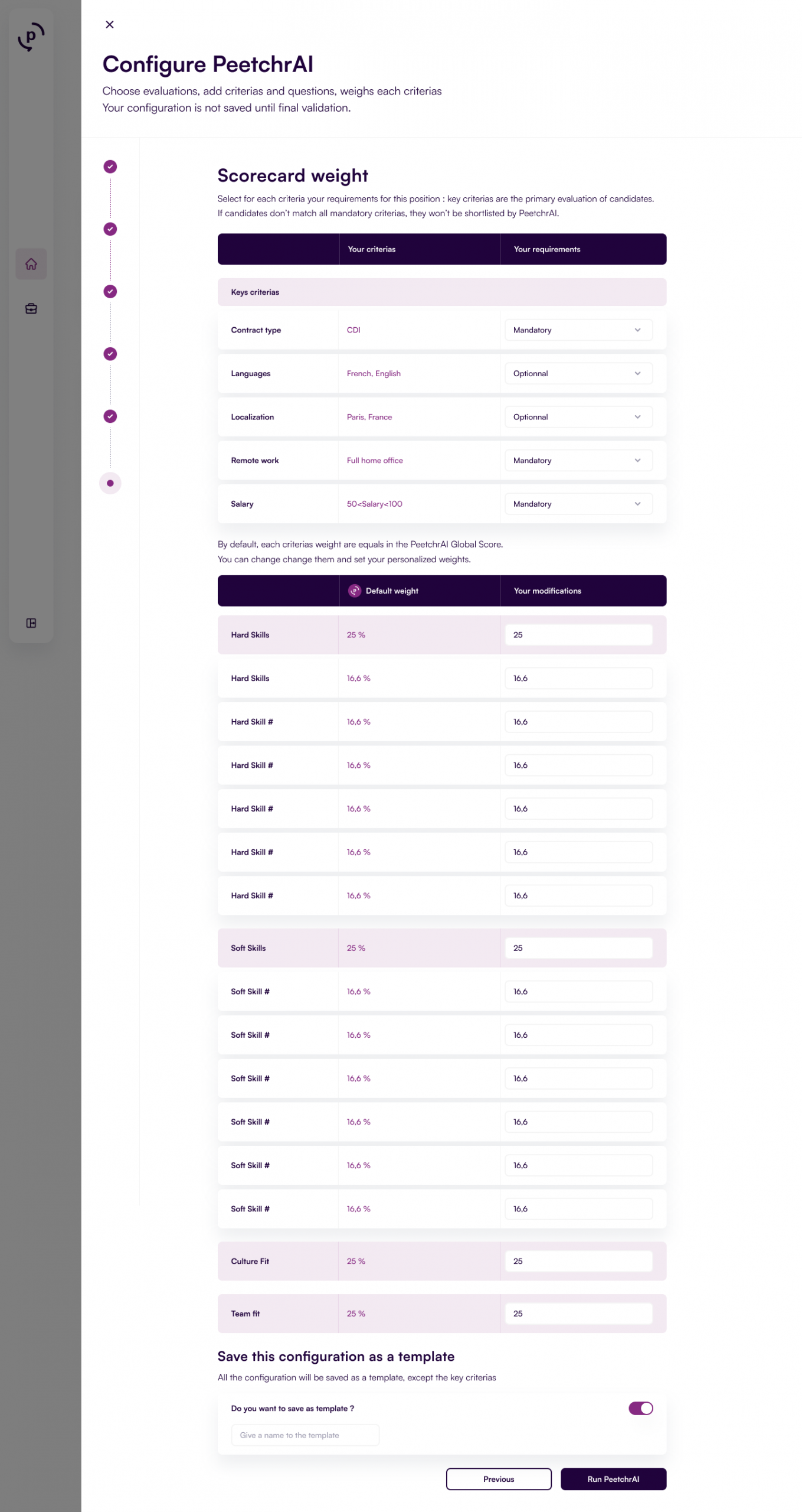
- Change the weight of each analysis, in the final AI Score, effectively creating a custom scorecard for every role.
This was achieved through a series of clear configuration pages:
- Key Criteria: Set mandatory or optional criteria to help recruiter make a first selection (Salary, localization, remote, contract type, and language).
- Hard & Soft Skills: Review and validate the specific skills the AI will screen for.
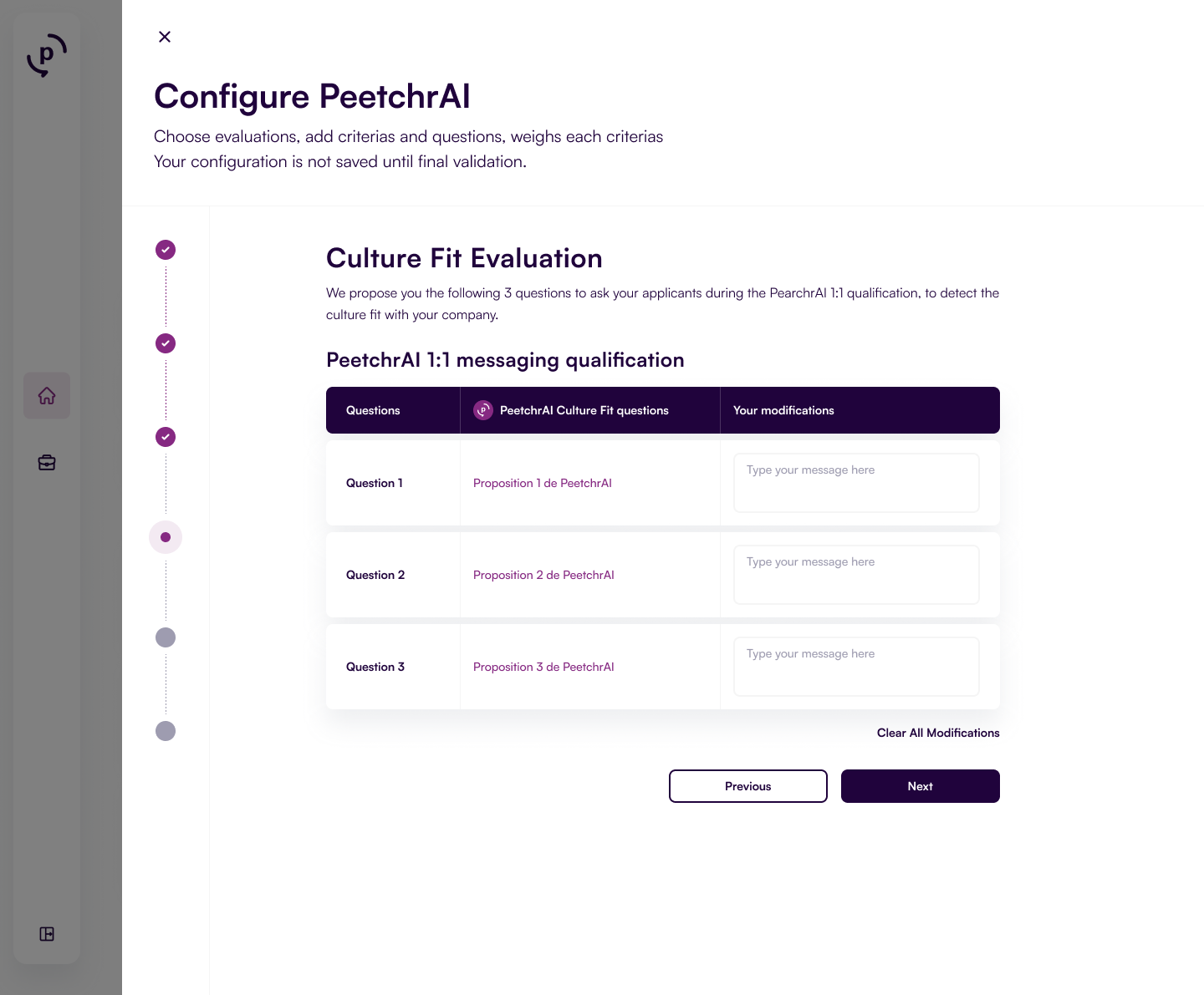
- Culture Fit: Define the cultural values and attributes relevant to the position.
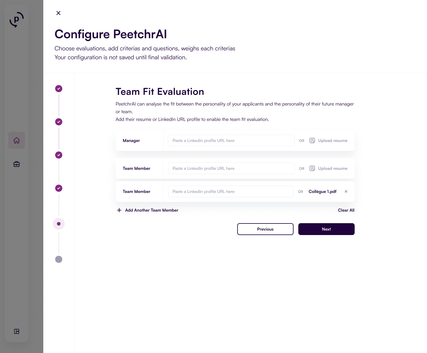
- Team Fit: Provide the LinkedIn profiles or CVs of the hiring manager or team members for comparative analysis.
- Scorecard Weights: Set different weights for each criteria, skills or questions because each recruitment is different
By allowing users to not only see but also weight each element of the analysis, the AI was transformed from an intimidating « black box » into a transparent and helpful co-pilot, fully aligned with the recruiter’s unique expectations for each role.
By giving back control, we solidified trust in the system.
Pillar 2: Giving Control Through Transparency
Trust is unsustainable without control. Recruiters rely on scorecards to rationally compare candidates, and they need visibility into any tool that assists this process. The first version of our product, which used an abstract system of tests and questions, failed to provide this clarity.
For the new version, we implemented a robust configuration process that allows users to:
- Review the details of each analysis for every job they create and fine tune the analysis (skills to analyse or question to ask candidates).
- Change the weight of each analysis, in the final AI Score, effectively creating a custom scorecard for every role.
This was achieved through a series of clear configuration pages:
- Key Criteria: Set mandatory or optional criteria to help recruiter make a first selection (Salary, localization, remote, contract type, and language).
- Hard & Soft Skills: Review and validate the specific skills the AI will screen for.
- Culture Fit: Define the cultural values and attributes relevant to the position.
- Team Fit: Provide the LinkedIn profiles or CVs of the hiring manager or team members for comparative analysis.
- Scorecard Weights: Set different weights for each criteria, skills or questions because each recruitment is different
By allowing users to not only see but also weight each element of the analysis, the AI was transformed from an intimidating « black box » into a transparent and helpful co-pilot, fully aligned with the recruiter’s unique expectations for each role.
By giving back control, we solidified trust in the system.
Organizing the candidate funnel: when business process and UX writing merge
The original product’s funnel was inefficient, attempting to replicate the entire recruitment process and forcing recruiters to manage candidates in two separate systems (Peetchr and their ATS). It also contained confusingly named stages.
Our new value proposition — to reduce the time to qualification — allowed us to simplify the funnel dramatically. The new funnel focused only on the steps directly impacted by Peetchr and added stages to give the recruiter final say.
The new funnel included: All Applicants, Shortlisted by Peetchr, Recruiter Shortlist, and Recruiter Rejection.
One funnel to support Peetchr value proposition:

A significant challenge was finding the right UX writing for the action buttons. Words like « Validate » or « Proceed » were too strong, implying a final hiring decision. We ultimately chose:
- « Select« : This word accurately communicates the action of creating a personal shortlist without implying final validation
- « Reject« : This word is intentionally strong to clearly indicate that a candidate will not move forward in the process
This new, simpler funnel design directly supported our promise of efficiency, allowing recruiters to quickly identify and select the top candidates for their own shortlist.
Creating a New Brand Identity: Seriousness and Humanity
Creating a New Brand Identity: Seriousness and Humanity
Feedback indicated that customers were unimpressed with the initial graphic design.
In collaboration with UI Designer Yaelle Cannamela, we developed a new brand identity that would feel both professional and human. It led us to create the first design system for Peetchr.
Recognizing that many HR departments use austere interfaces, we aimed to create something more vibrant and elegant.

Btw, Yaelle is a very talented UI Designer and I strongly recommend you to work with her too! Connect with her here → https://www.linkedin.com/in/yaelle-cannamela-a049a510/
Feedback indicated that customers were unimpressed with the initial graphic design.
In collaboration with UI Designer Yaelle Cannamela, we developed a new brand identity that would feel both professional and human. It led us to create the first design system for Peetchr.
Recognizing that many HR departments use austere interfaces, we aimed to create something more vibrant and elegant.
Btw, Yaelle is a very talented UI Designer and I strongly recommend you to work with her too! Connect with her on LinkedIn!
Our colors

- Primary (Dark Blue): Chosen to convey a sense of seriousness, stability, and serenity, befitting a professional B2B service that deals with important decisions.
- Secondary (Pink): Chosen to represent the human side of recruitment—empathy, intimacy, and care for both the company and the candidate.
- Gradient (Pink to Blue): A gradient combining the two colors was used to represent the energy, vibrancy, and future-oriented nature of hiring new talent.
Our illustrations
For the initial release, we made a strategic decision to use a minimalistic design without illustrations or avatars for two key reasons:
- To Save Time: We wanted to avoid spending time on design assets that might not add immediate value and could delay our tight schedule.
- To Avoid Inconsistency: With features still being finalized, we avoided the risk of creating illustrations that might quickly become inconsistent with the evolving product.
Our colors
- Primary (Dark Blue): Chosen to convey a sense of seriousness, stability, and serenity, befitting a professional B2B service that deals with important decisions.
- Secondary (Pink): Chosen to represent the human side of recruitment—empathy, intimacy, and care for both the company and the candidate.
- Gradient (Pink to Blue): A gradient combining the two colors was used to represent the energy, vibrancy, and future-oriented nature of hiring new talent.
Our illustrations
For the initial release, we made a strategic decision to use a minimalistic design without illustrations or avatars for two key reasons:
- To Save Time: We wanted to avoid spending time on design assets that might not add immediate value and could delay our tight schedule.
- To Avoid Inconsistency: With features still being finalized, we avoided the risk of creating illustrations that might quickly become inconsistent with the evolving product.
Phase 4
Disciplined Development & Delivery
Upon my arrival, there was no formal roadmap beyond a weekly task list. My first action was to introduce structure and visibility by creating a comprehensive product roadmap in Linear integrating epics and features in a 6 months roadmap, a quarter after the commercial release in June.

The design phase was followed by a highly coordinated 2.5-month development sprint, led in strong partnership with the CTO, Florian Vidal. Look at his LinkedIn profile here → https://www.linkedin.com/in/florianvidal/.
The design phase was followed by a highly coordinated 2.5-month development sprint, led in strong partnership with the CTO, Florian Vidal
Our new planning process
2. Prioritizing the necessary features for the commercial release (MVP) versus optional features for future value-add
3. Collaborating with the CTO to review features, add technical requirements, and estimate development time
4. Conducting a workshop with the CTO to logically sequence the feature releases on a Gantt chart
5. Presenting and validating the final roadmap with the co-founders.
6. Meeting the CTO weekly to update the roadmap according to evolutions prior to the weekly meeting with founders.
This smooth and collaborative process was essential for managing a stressful environment. It ensured that the technical team felt respected in their estimations, the product goals were realistic, and the co-founders gained control and a clear view of the path to launch and beyond.
Of course, everything never happens like planned. But that’s for another story 😉.
Impact
The fully rebuilt product was officially released on June 30th, 2025. The market’s response was immediate and validated our strategic pivot.